
An English Ad-man in Berlin
New Town, New Brand and Spree Quell
Just over a year ago me and the family relocated to Berlin…There were many reasons for the move but the main one was to start up my own agency, Black Paint.
Setting up in a new country is very exciting.
And at times, pretty challenging.
New language, new landscape and new cultural nuances which need to be learned and observed. Yes, Germans – and especially Berliners – really are more direct than us Brits... And unlike Brits, they are more sparing with their use of “please”, “thank you” and “sorry”. To a German, dropping “bitte” and “danke” all over the place is simply weird.
In the first few months we were here, we were often surprised at how much more tired we felt. The answer to this new level of fatigue – or at least my conclusion – was realising just how much of daily life is spent on autopilot. This changes when everything is new. Even the most mundane daily tasks require a lot more mental energy and autopilot is not an option.
And this takes us to the point…
A new country, new places, systems and processes to discover and learn to navigate.
And a lot of new brands you have never seen or heard of vying for your attention.
Interesting what this meant for trips to the local supermarket.
Faced with so many new and unfamiliar brands. A mundane, everyday experience which is normally done on autopilot, suddenly required much more thought and effort.
The importance of brand salience, mental availability and formation of so-called memory structures became far less abstract than it was to me as a Londoner who had spent years around agency planners as I experienced, in a real world setting, how much those things actually help you do your shopping without having to think too much. And who wants to expend significant mental effort walking around a supermarket…
I also noticed an urge to choose brands that were also available in Britain – even when they were brands I had never actually purchased when I lived there…”Ah, Colgate toothpaste, aren’t you a site for sore eyes, in the shopping basket you go!”
Fast forward, to 2020 and we have been here almost two years. I now have a whole range of new brands in my repertoire and have returned to the far more desirable state of shopping on autopilot and being able to think about more interesting things while pushing the shopping trolley from aisle to aisle.
So, looking at my new repertoire of German brands. There is one I wanted to talk about…
I drink a lot of sparkling water… And the brand I have settled on in Berlin is called Spree Quell.
I’m not sure why I chose it initially.
I probably liked the sturdy bottle which feels quite premium for a product priced considerably below other premium brands like say, San Pellegrino.
The price point also chimes with my personal belief that spending a lot of money on carbonated water is a mugs game… Whilst at the same time, and rather contradictory to the last point, fancying myself as someone who likes a bit of quality and will pay a little more to feel I’m getting it.
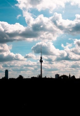
Maybe I also chose it because I was new in Berlin, enamoured with the allure of the city and gravitated to the artwork on the bottle which features an outline of the Berlin skyline.
Whatever the factors were, once established as my sparking water of choice, only then did I start to notice its advertising…
And I thought it was utterly awful…
Dull, contrived and clichéd. Trying desperately hard to depict “authentic, real life moments” to get people to relate as so many ads try and fail to do.
Here is the first. This was plastered on billboards throughout Berlin in 2019.
Two attractive 20-something hipsters.
Looks like they’re running a second-hand stall in the kind of hipster frequented bric-a-brac markets one sees in the bohemian but somewhat gentrified Berlin districts of Kreuzberg, Friedrichshain or Prenzlauberg. Places where people have more spending power than their shabby vintage clothing would suggest. A good place for Spree Quell to be present.
In the ad, one of the girls smiles off camera as if beckoning over some hipster friends she has just spotted. Meanwhile, her friend sits in the foreground in a state of calm, blissful contentment cradling her bottle of Spree Quell as if it were a new-born baby.
The message is clear.
And about as subtle as a sledgehammer.
We (Spree) are young, fresh and trendy just like you, we are the perfect refreshing accompaniment to your bohemian lifestyle. Cool millennials and Gen Z’ hipsters…Buy us, we get you and your life.
Terrible.
Then I saw the next…And it got worse
An attractive young couple. Less hipster than the last. Having a pillow fight.
So committed are they to their fight, so much exertion have they devoted to it, that having just received a pillow-splitting blow to the head, the guy reaches for the only thing that will give him the refreshment he needs to return to the fray.
His bottle of Spree Quell.
The message is clear…The emotional content about as putrid as a pint of unfiltered Thames river water.
We are young and fresh, the perfect accompaniment to the little moments in your domestic lives.
An execution based on a truth that doesn’t exist for most people…
And an idea that just might have been gifted with a few redeeming features if only the execution wasn’t so full of artifice.
Creative aside, in both ads the brand name and logo, somehow get lost, even though they are featured three times in each ad.
As you can tell, I was not impressed.
For a brand which is stocked pretty much everywhere in the city and whose DNA is intrinsically linked to Berlin (The water is drawn from a spring near the source of Berlin’s famous river Spree), the label bears the city skyline on it, these ads fell wide off the mark.
Then recently all that changed.
Travelling on the metro recently I saw the latest Spree Quell Out of Home.
And what a refreshing change of direction it was…
Says everything about the product (Without saying much at all) – It’s just water, pure enough to bathe in.
Says everything about how they want to the product to make you feel – refreshed and relaxed.
All in a simple and beautifully executed Ad, which is playful, modern and smart (Without trying too hard to be).
And unlike the previous examples which put the branding everywhere and nowhere this only features the brand name and logo once, where it is not only front and centre but integral to the creative and where the artwork (Man and Shadow) naturally help draw the eye to the logo.
Also an idea that will translate far better to digital channel executions than the previous efforts.
Distinctive, funny and memorable.
Bravo Spree Quell!
For wisely changing direction. Making efforts to stand out in your category. Creating a piece of advertising that has a far higher probability of appealing to anyone who buys sparkling water whether they’re hip, square, old or young.
And for generally getting your shit together.

